Redesigning Fleeture
A 1990s desktop platform moved to the web. Everything looks new;
almost nothing works differently.
1/4 • setup
Product
Fleeture GmbH builds software for road freight logistics — dispatch planning, tender management, partner data, and fleet data.
The platform had been running since the 1990s, built in Windows Forms. It worked. That’s the part that usually gets skipped in a redesign story, and it’s the part that shaped every decision here.

Domain
Fleet management

Timeline
July 2023 – October 2024 • 10 hours/week

My role
Fractional sole designer

Team
10–15 • Engineers, C-level stakeholders, PM
The problem
The company was moving the platform to the web — the desktop app was impractical to update and distribute. The front-end developer argued the interface needed rebuilding, not just re-platforming.
The users, meanwhile, weren’t struggling or complaining with it — they were fluent in it.
Scope
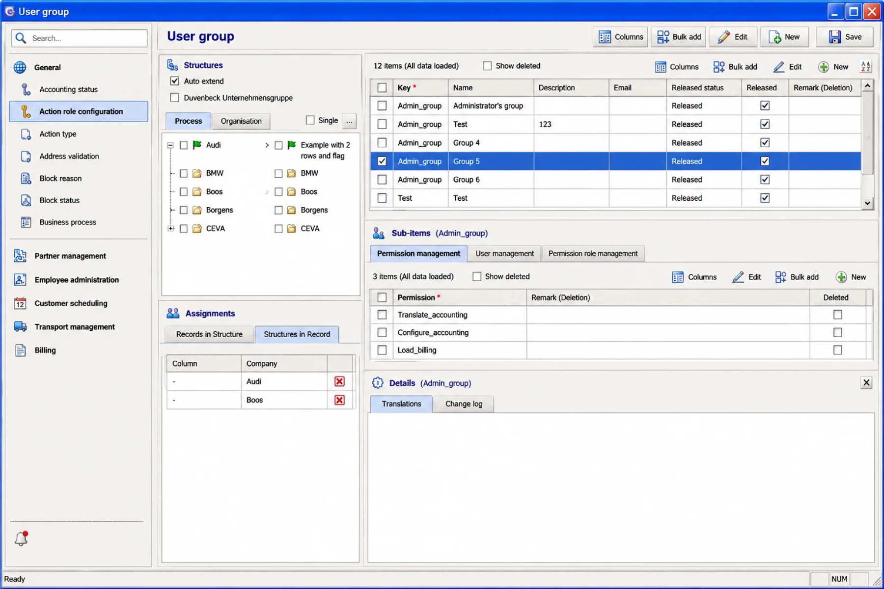
The stakeholders had been studying modern SaaS and wanted the platform to feel like that. Their brief, more or less: make the complicated screens sexy.

Change how it looks.
Don’t change how it works.
Success criteria
Success was defined in engineering terms — a platform that could be updated, deployed and extended.
2/4 • payoff
Final solution
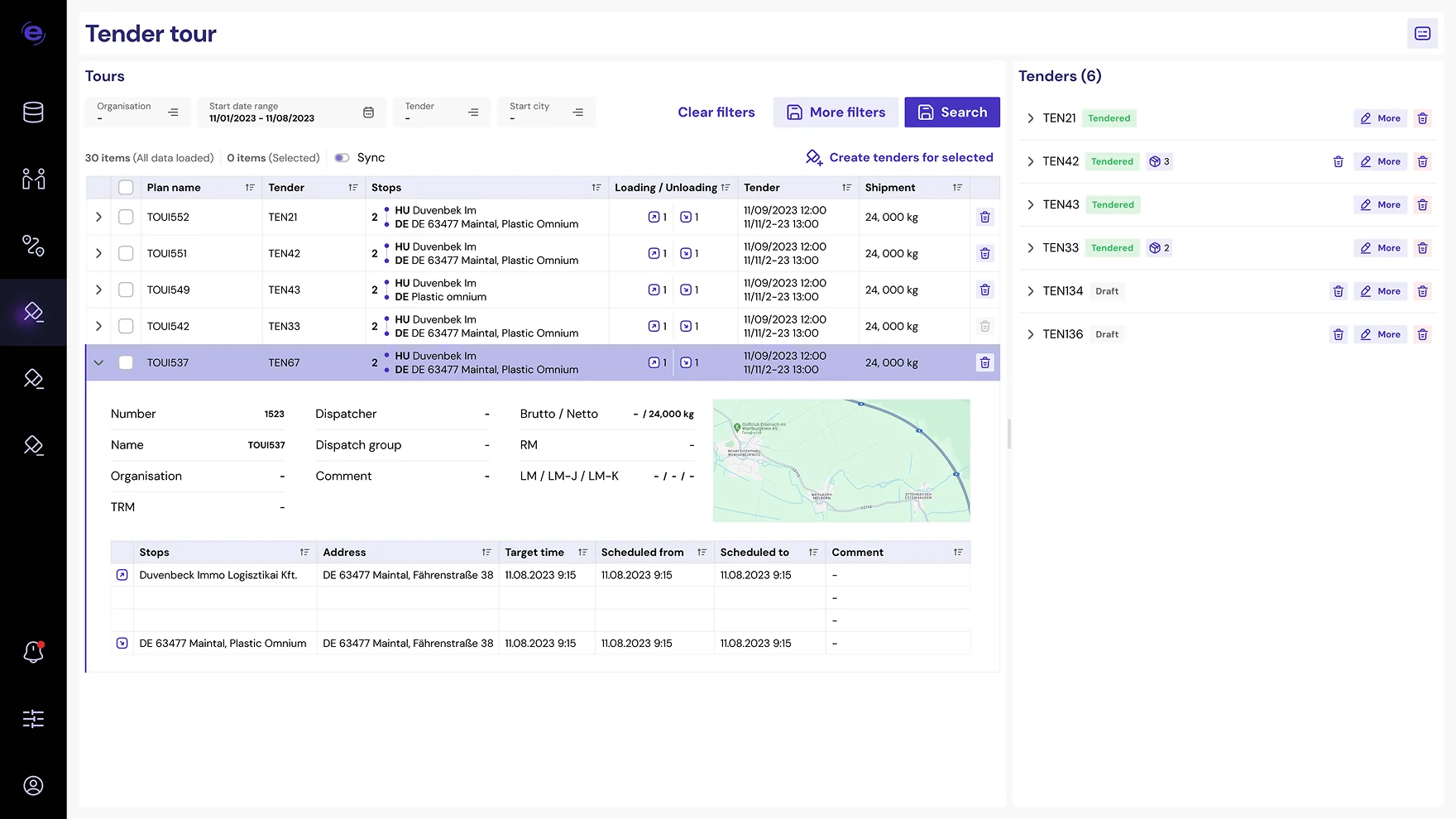
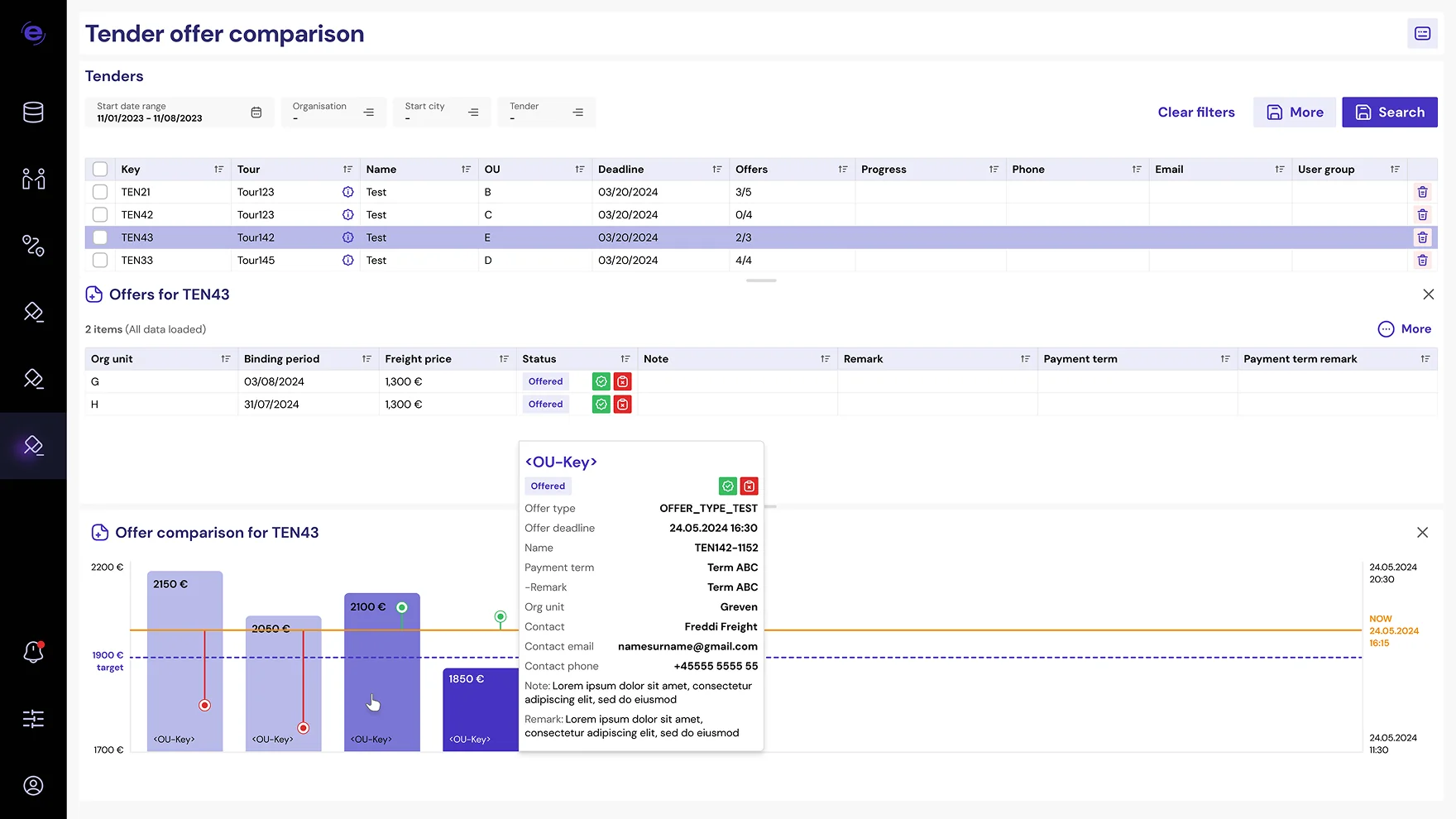
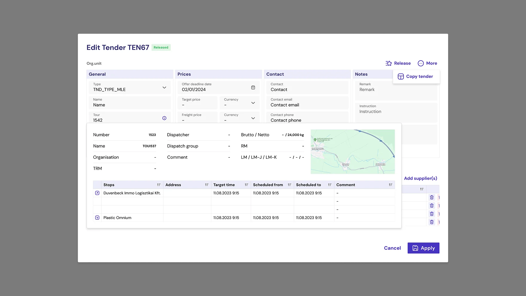
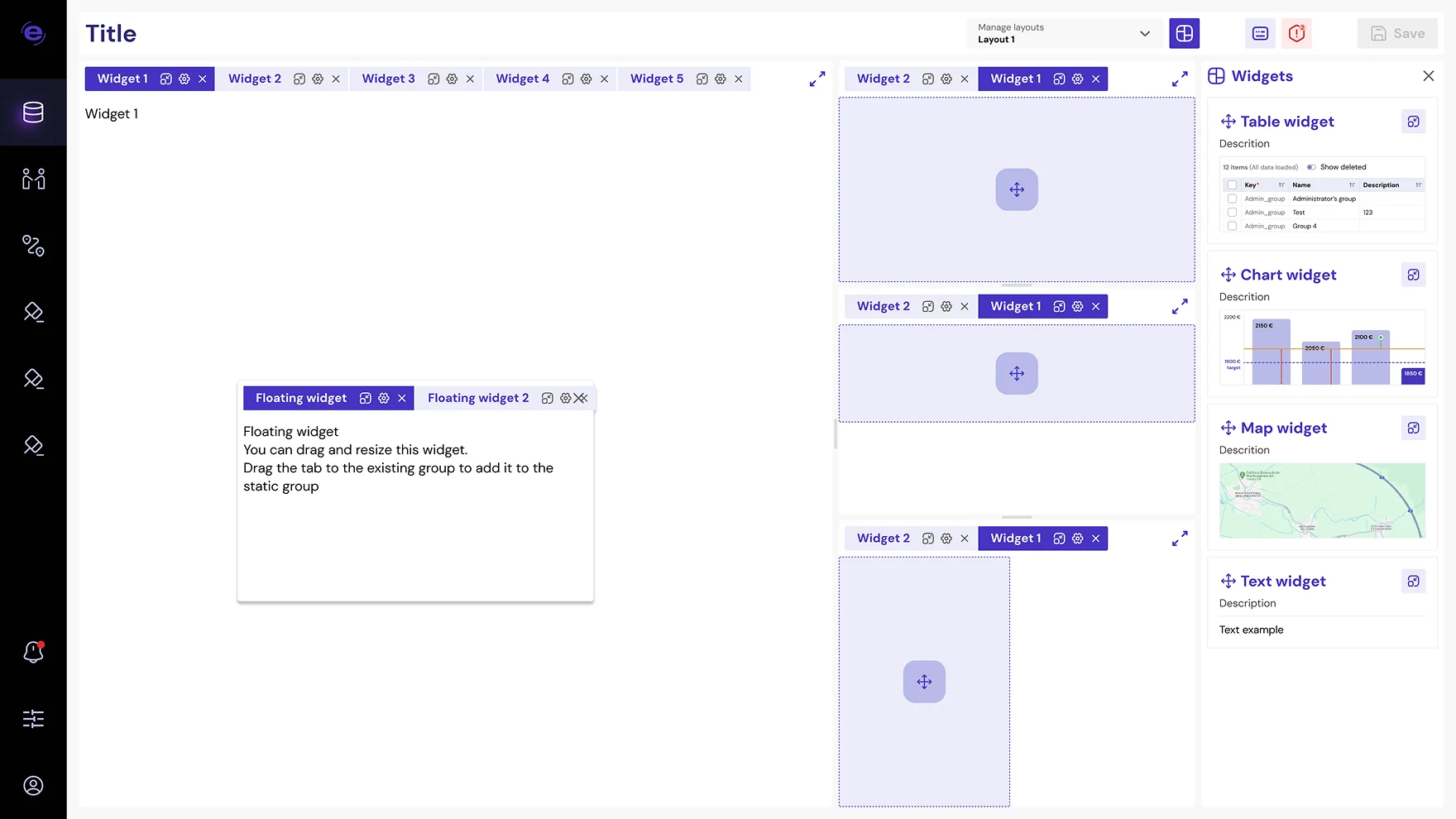
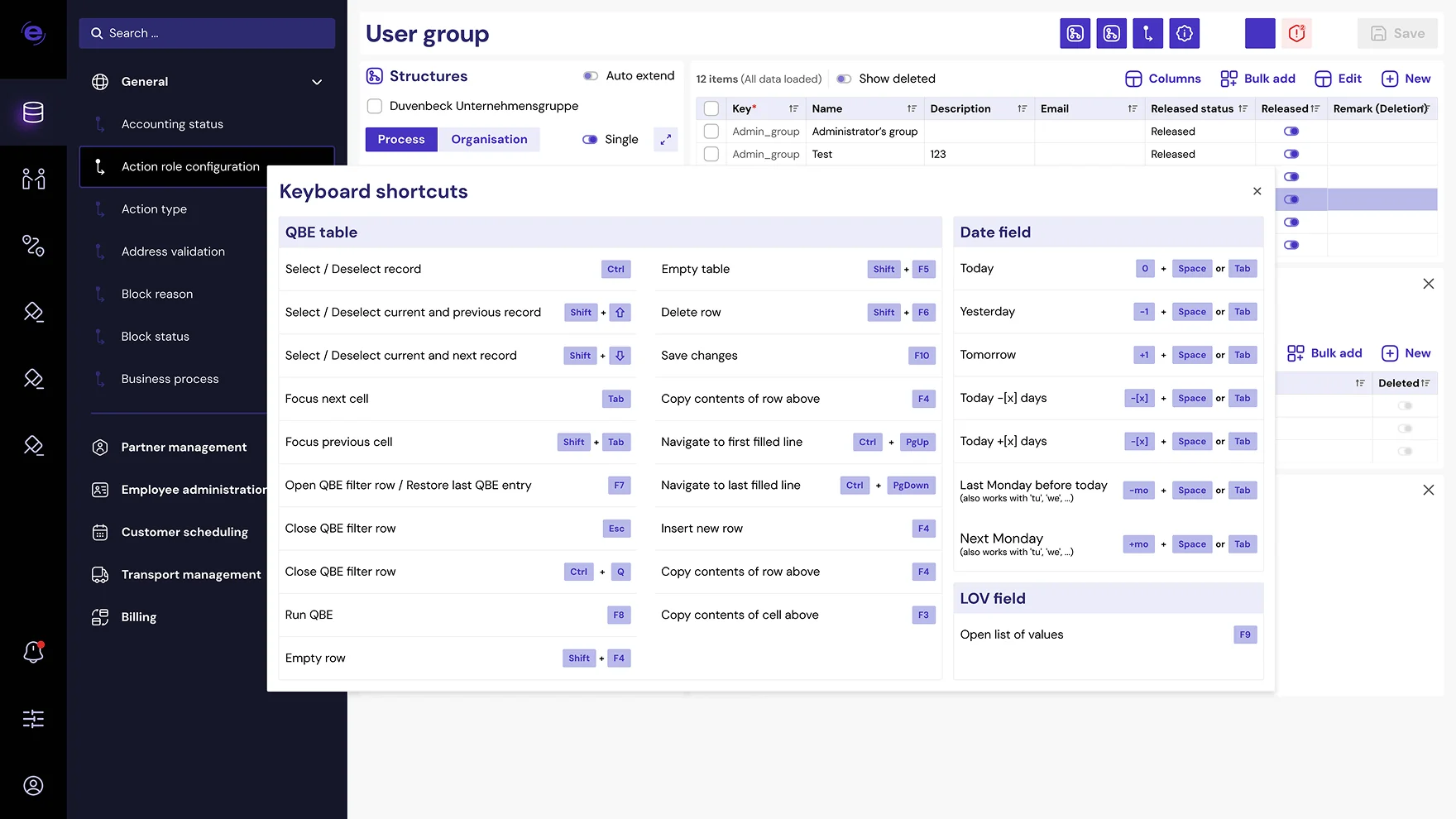
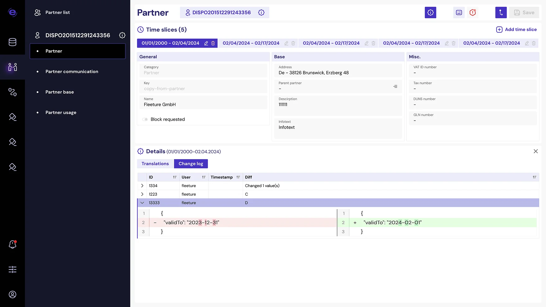
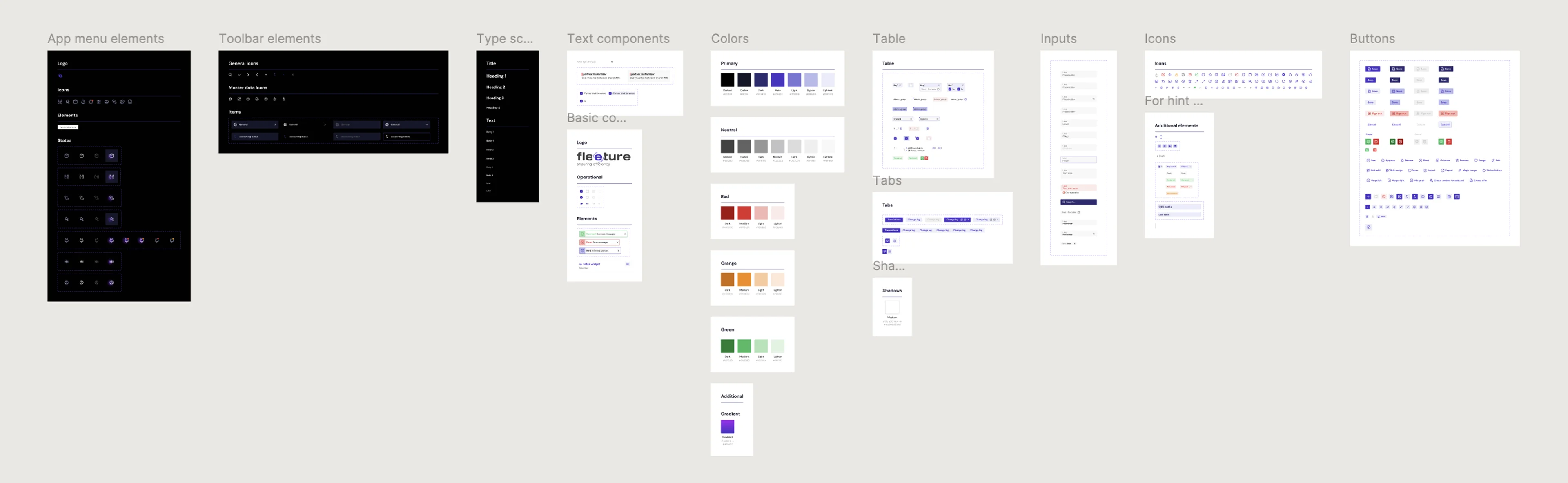
The platform moved to the web with three things it had never had: a full visual language, a component system underneath it, and interaction specs precise enough that the engineers could build without waiting on me.
By October 2024 the redesign was partially in use by clients. It stopped there — the investment behind the project was cancelled, and the work ended with it.
The system
The design system had to work without a designer present. The engineers built continuously; I was in the room twice a week.
Impact
On the criteria the company set, it worked. The platform was deployable and extensible, and the engineers kept shipping for a year without design blocking them. By my rough estimate, the component system at least halved the time it took to build a screen.
Review

When we started, design wasn’t a structured part of our development process. Viktoria built a comprehensive design system from the ground up, giving the team consistency and significantly speeding up development.
What I appreciate most is that she doesn’t just design interfaces — she solves product problems. She thinks like a product partner, always looking for the best solutions from both the user and business perspectives.

George Reznichenko
Senior software engineer team lead • Fleeture
3/4 • journey
No research, so I read the product
There was no user research on this project — no interviews, no testing, no analytics I could see. What stood in for it was the application itself, read as a system rather than a set of screens.
The engineering team partly closed that gap. They had lived with the platform and its customers for years.
Agreeing the direction
The stakeholders had never commissioned design work before, but they had a reference — modern SaaS, confident colour — and that one-line brief. The difficulty was in the word complicated, and that took the next section to solve.

First, the direction had to be agreed. Options went up; purple was the one they chose. Settling taste early meant the next 16 months were spent arguing about execution, not direction.
Starting the system
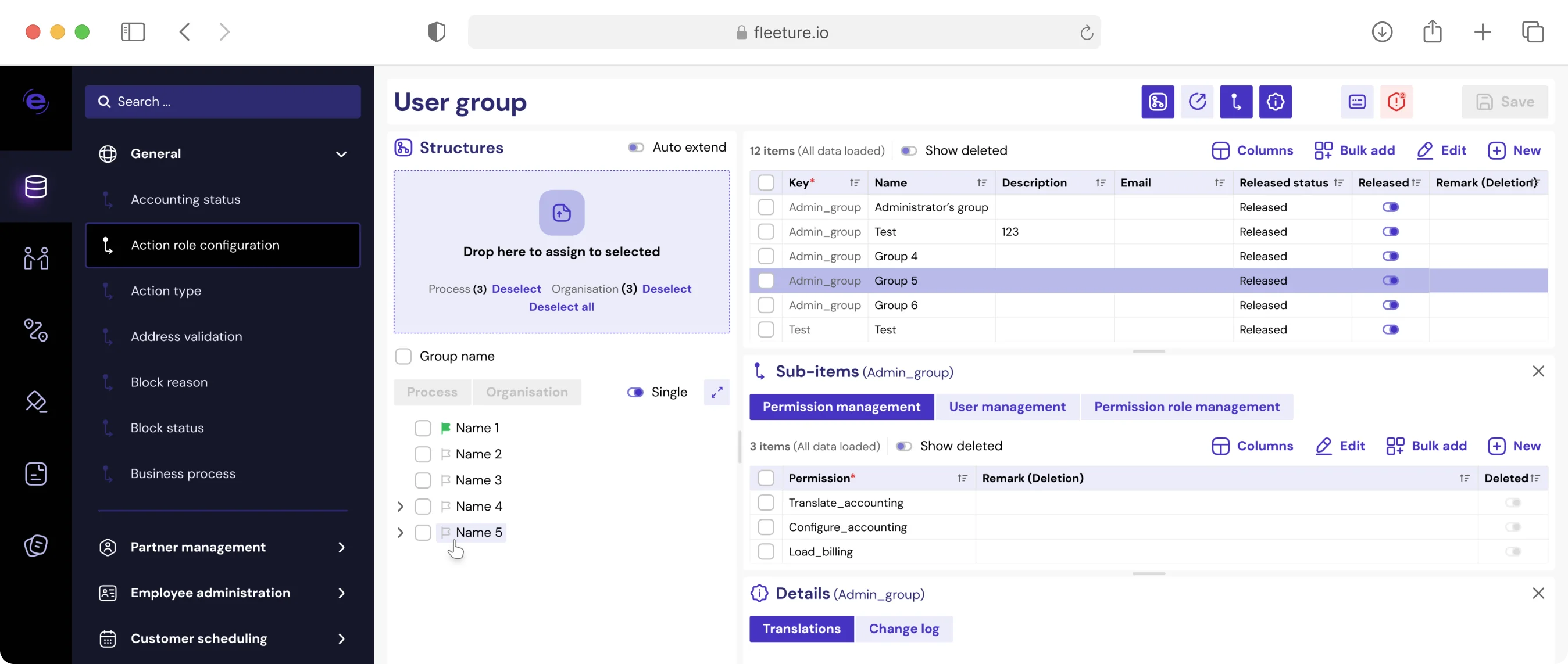
I built the foundations — colour, type, and spacing — on the hardest screen in the product before generalising anything, because rules tuned on a simple screen collapse the moment they meet a real one.
The reference products the stakeholders admired were simple ones — generous whitespace, few elements per view, colour used freely because there’s room for it. Fleeture is the opposite.
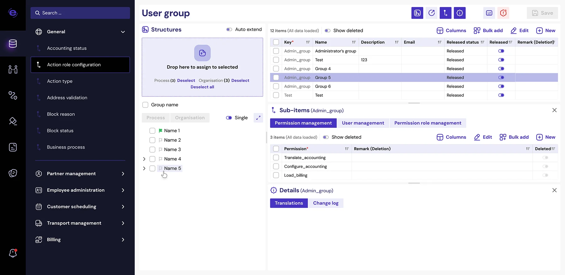
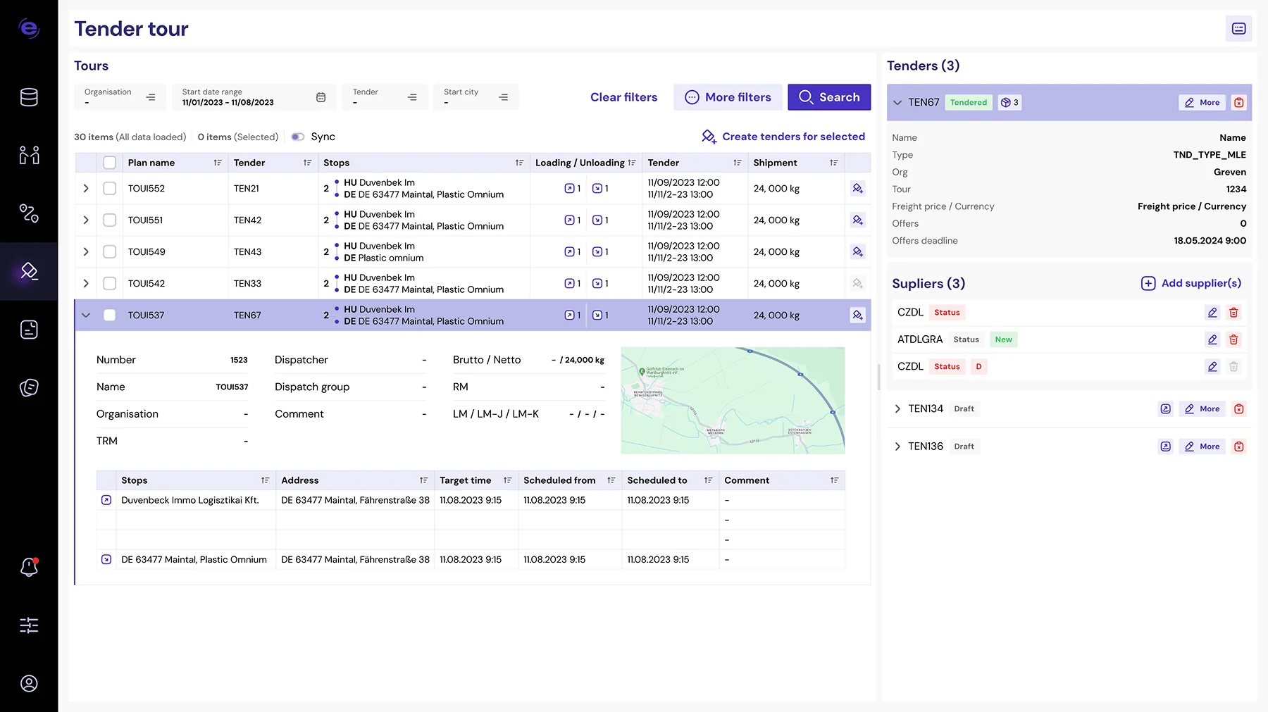
What made those products feel modern wasn’t a lighter interface — it was surface quality. Consistent spacing, considered feedback, and every state defined.
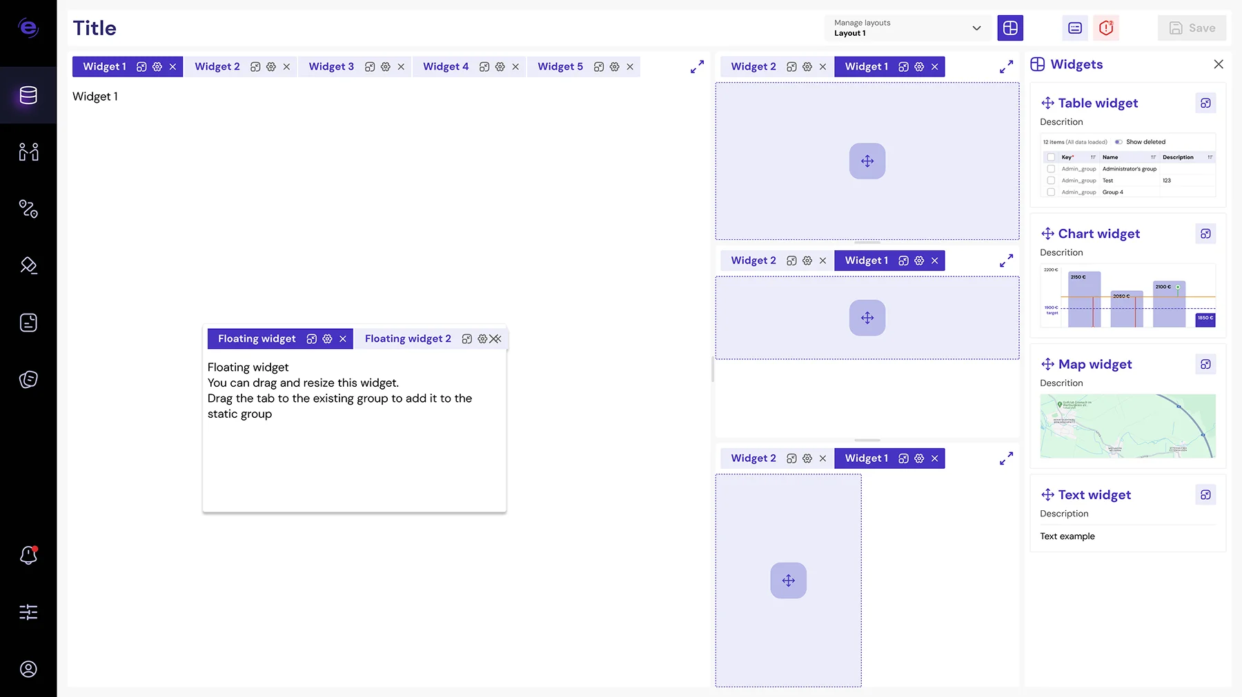
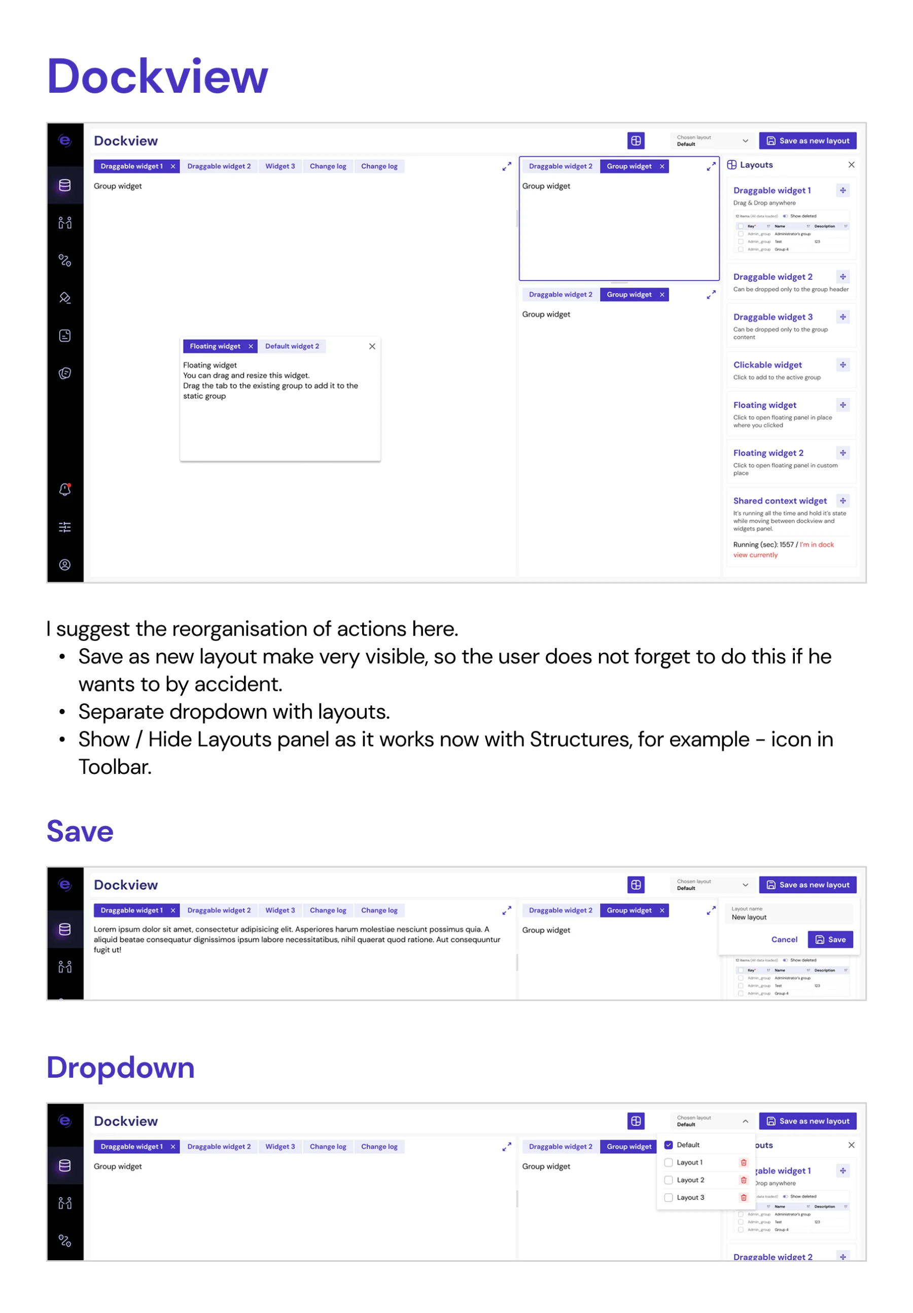
Panels, nested tables, tabs, and dividers the user can drag — so the foundations had to hold at every width, not just the one I designed at.
Working rhythm
Twice a week I presented three things: what was built, what was decided, and what was still open. Feedback happened in the room.

Six months in, the work was shown to the whole company and landed well. Without metrics, that was the only signal available.
Validation
There was no usability testing. The redesigned platform went through client testing for validation and reached production with some of them.
4/4 • reflection
What I’ve learned

Without users, the interface work stays incomplete
Reading the product told me what it does, not where anyone struggles. I could keep the behaviour intact — but I couldn’t tell whether it should have changed. That gap reaches the interface itself: you can define every state correctly and still not know which ones people actually hit.
What I’d do differently

Show it to users, not just stakeholders
Late validation is the real weakness of this process. Reading the existing product substituted for research well enough to build a system on, but it answers a different question — what the product does, not where people struggle.
Let’s connect
Currently
open to Staff & Principal roles
—
full‑time or fractional.

